4. Linear Regression#
Regression analysis is a statistical process for estimating the relationships between two or more variables. The relationship is modeled as \(y \sim x\) or \(y = f(x)\). Both model descriptions indicate that the variable \(y\) is a function of \(x\). Therefore the variable \(y\) is denoted as response variable or dependent variable, whereas the variable \(x\) is denoted as predictor variable or independent variable.
4.1. Simple Linear Regression#
In this section we discuss a special type of regression, which is called simple linear regression. In this special case of regression analysis the relationship between the response variable \(y\) and and the predictor variable \(x\) is given in form of a linear equation
where \(a\) and \(b\) are constants. The number \(a\) is called intercept and defines the point of intersection of the line and the \(y\)-axis (\(x=0\)). The number \(b\) is called regression coefficient. It is a measure of the slope of the regression line. Thus, \(b\) indicates how much the \(y\)-value changes when the \(x\)-value increases by 1 unit. The adjective simple refers to the fact that the outcome variable is related to a single predictor. The model is considered as a deterministic model, as it gives an exact relationship between \(x\) and \(y\).
Let us consider a simple example. Given a population of \(n = 3\) points with Cartesian coordinates \((x_i,y_i)\) of \((1,6)\), \((2,8)\) and \((3,10)\). These points plot on a straight line and thus, can be described by a linear equation model in the form of \(y= a + bx\), where the intercept \(a=4\) and \(b=2\).

In many cases, the relationship between two variables \(x\) and \(y\) is not exact. This is due to the fact, that the response variable \(y\) is affect by other unknown and/or random processes, that are not fully captured by the predictor variable \(x\). In such a case the data points do not line up on a straight line. However, the data still may follow an underlying linear relationship. In order to take these unknowns into consideration a random error term, denoted by \(\epsilon\), is added to the linear model equation, thus resulting in a probabilistic model in contrast to the deterministic model from above.
where the error term \(\epsilon_i\) is assumed to consist of independent normal distributed values, \(e_i \sim N(0, \sigma^2)\).
In linear regression modelling following assumptions are made about the model (Mann 2012).
The random error term \(\epsilon\) has a mean equal to zero for each \(x\).
The errors associated with different observations are independent.
For any given \(x\), the distribution of errors is normal.
The distribution errors for each \(x\) has the same (constant) standard deviation, which is denoted by \(\sigma_{\epsilon}\).
Let us consider another example. This time we take a random sample of sample size \(n = 8\) from a population. In order to emphasis that the values of the intercept and slope are calculated from sample data, \(a\) and \(b\) are denoted by \(\beta_0\) and \(\beta_1\), respectively. In addition, the error term \(\epsilon\) is denoted as \(e\). Thus, \(\beta_0\), \(\beta_1\) and \(e\) are estimates based on sample data for the population parameters \(a\), \(b\) and \(\epsilon\).
where \(\hat y\) is the the estimated or predicted value of \(y\) for any given value of \(x\).

The error \(e_i\) for each particular pair of values (\(x_i,y_i\)), also called residual, is computed by the difference of the observed value \(y_i\) and the predicted value given by \(\hat y_i\).
Depending on the data \(e_i\) is a negative number if \(y_i\) plots below the regression line or it is a positive number if \(y_i\) plots above the regression line.
4.1.1. Parameter Estimation: Ordinary Least Squares Method#
Now, as we relaxed the constraints of the deterministic model and introduced an error term \(\epsilon\), we run into another problem. There are infinitely many regression lines that fulfill the specifications of the probabilistic model.

Obviously, we need a strategy to select that particular regression line, which corresponds to the best model in order to describe the data. In this section we discuss on one of the most popular methods to achieve that task, the so called ordinary least squares method (OLS).
As mentioned in the previous section for each particular pair of values \((x_1,y_1)\) the error \(e_i\) is calculated by \(y_1-\hat y\). In order to get the best fitting line for the given data the error sum of squares, denoted by SSE, is minimized.
For the simple linear model there exists an analytic solution for \(\beta_1\).
and \(\beta_0\).
The OLS gives the maximum likelihood estimate for \(\hat{\beta}\) when the parameters have equal variance and are uncorrelated, and the residuals \(\epsilon\) are uncorrelated and follow a Gaussian distribution (homoscedasticity).
4.2. Simple Linear Regression: An example#
In order to get some hands-on experience we apply the simple linear regression in an exercise.
For this example, we will use a daily time series from the DWD weather station Berlin-Dahlem (FU), downloaded from Climate Data Center on 2022-07-22. A detailed description of the variables is available here. For the purpose of this tutorial the dataset is provided here.
You find a documentation of this data in german and english.
# First, let's import all the needed libraries.

import pandas as pd
import seaborn as sns
import matplotlib.pyplot as plt
import numpy as np
from scipy import stats

import warnings

warnings.filterwarnings("ignore", "use_inf_as_na")
import requests, zipfile, io

url = "http://userpage.fu-berlin.de/soga/soga-py/300/307000_time_series/tageswerte_KL_00403_19500101_20211231_hist.zip"
r = requests.get(url)
z = zipfile.ZipFile(io.BytesIO(r.content))
z.extract("produkt_klima_tag_19500101_20211231_00403.txt", "../data")
data_raw = pd.read_csv(
    "../data/produkt_klima_tag_19500101_20211231_00403.txt",
    sep=";",
    na_values=["-999"],
    skipinitialspace=True,
)
data_raw
| STATIONS_ID | MESS_DATUM | QN_3 | FX | FM | QN_4 | RSK | RSKF | SDK | SHK_TAG | NM | VPM | PM | TMK | UPM | TXK | TNK | TGK | eor | |
|---|---|---|---|---|---|---|---|---|---|---|---|---|---|---|---|---|---|---|---|
| 0 | 403 | 19500101 | NaN | NaN | NaN | 5 | 2.2 | 7 | NaN | 0.0 | 5.0 | 4.0 | 1025.60 | -3.2 | 83.00 | -1.1 | -4.9 | -6.3 | eor |
| 1 | 403 | 19500102 | NaN | NaN | NaN | 5 | 12.6 | 8 | NaN | 0.0 | 8.0 | 6.1 | 1005.60 | 1.0 | 95.00 | 2.2 | -3.7 | -5.3 | eor |
| 2 | 403 | 19500103 | NaN | NaN | NaN | 5 | 0.5 | 1 | NaN | 0.0 | 5.0 | 6.5 | 996.60 | 2.8 | 86.00 | 3.9 | 1.7 | -1.4 | eor |
| 3 | 403 | 19500104 | NaN | NaN | NaN | 5 | 0.5 | 7 | NaN | 0.0 | 7.7 | 5.2 | 999.50 | -0.1 | 85.00 | 2.1 | -0.9 | -2.3 | eor |
| 4 | 403 | 19500105 | NaN | NaN | NaN | 5 | 10.3 | 7 | NaN | 0.0 | 8.0 | 4.0 | 1001.10 | -2.8 | 79.00 | -0.9 | -3.3 | -5.2 | eor |
| ... | ... | ... | ... | ... | ... | ... | ... | ... | ... | ... | ... | ... | ... | ... | ... | ... | ... | ... | ... |
| 26293 | 403 | 20211227 | NaN | NaN | NaN | 3 | 0.0 | 8 | 0.183 | 0.0 | 5.9 | 3.8 | 998.13 | -3.7 | 79.67 | -0.7 | -7.9 | -9.9 | eor |
| 26294 | 403 | 20211228 | NaN | NaN | NaN | 3 | 1.5 | 6 | 0.000 | 0.0 | 6.4 | 5.3 | 990.17 | -0.5 | 88.46 | 2.7 | -3.9 | -5.1 | eor |
| 26295 | 403 | 20211229 | NaN | NaN | NaN | 3 | 0.3 | 6 | 0.000 | 0.0 | 7.5 | 8.2 | 994.40 | 4.0 | 100.00 | 5.6 | 1.8 | 0.0 | eor |
| 26296 | 403 | 20211230 | NaN | NaN | NaN | 3 | 3.2 | 6 | 0.000 | 0.0 | 7.9 | 11.5 | 1001.70 | 9.0 | 98.54 | 12.7 | 4.6 | 2.3 | eor |
| 26297 | 403 | 20211231 | NaN | NaN | NaN | 3 | 5.5 | 6 | 0.000 | 0.0 | 7.7 | 12.5 | 1004.72 | 12.8 | 84.96 | 14.0 | 11.5 | 10.7 | eor |
26298 rows × 19 columns
4.2.1. Remove unnecessary columns#
By looking at the data and consulting the variable description, we can immediately find variables that are not useful for our purpose and drop them.
STATIONS_ID -> There is only one station in the data.
MESS_DATUM -> Since we are not interested in a time series analysis, this is just a numbering of the rows.
QN_3, FX, FM, eor -> These variables do not contain any data.
QN_4 -> This value is a data quality label and has no relation to weather data.
df = data_raw.drop(
    columns=[
        "STATIONS_ID",
        "MESS_DATUM",
        "QN_3",
        "FX",
        "FM",
        "NM",
        "eor",
        "QN_4",
        "RSK",
        "RSKF",
        "SHK_TAG",
        "SDK",
        "UPM",
        "VPM",
    ]
)
df
| PM | TMK | TXK | TNK | TGK | |
|---|---|---|---|---|---|
| 0 | 1025.60 | -3.2 | -1.1 | -4.9 | -6.3 |
| 1 | 1005.60 | 1.0 | 2.2 | -3.7 | -5.3 |
| 2 | 996.60 | 2.8 | 3.9 | 1.7 | -1.4 |
| 3 | 999.50 | -0.1 | 2.1 | -0.9 | -2.3 |
| 4 | 1001.10 | -2.8 | -0.9 | -3.3 | -5.2 |
| ... | ... | ... | ... | ... | ... |
| 26293 | 998.13 | -3.7 | -0.7 | -7.9 | -9.9 |
| 26294 | 990.17 | -0.5 | 2.7 | -3.9 | -5.1 |
| 26295 | 994.40 | 4.0 | 5.6 | 1.8 | 0.0 |
| 26296 | 1001.70 | 9.0 | 12.7 | 4.6 | 2.3 |
| 26297 | 1004.72 | 12.8 | 14.0 | 11.5 | 10.7 |
26298 rows × 5 columns
4.2.2. Rename columns for convenience#
To improve the readability, we rename the remaining columns.
df = df.rename(
    columns={
        "PM": "pres",
        "TMK": "temp",
        "TXK": "temp_max",
        "TNK": "temp_min",
        "TGK": "temp_sfc",
    }
)
df
| pres | temp | temp_max | temp_min | temp_sfc | |
|---|---|---|---|---|---|
| 0 | 1025.60 | -3.2 | -1.1 | -4.9 | -6.3 |
| 1 | 1005.60 | 1.0 | 2.2 | -3.7 | -5.3 |
| 2 | 996.60 | 2.8 | 3.9 | 1.7 | -1.4 |
| 3 | 999.50 | -0.1 | 2.1 | -0.9 | -2.3 |
| 4 | 1001.10 | -2.8 | -0.9 | -3.3 | -5.2 |
| ... | ... | ... | ... | ... | ... |
| 26293 | 998.13 | -3.7 | -0.7 | -7.9 | -9.9 |
| 26294 | 990.17 | -0.5 | 2.7 | -3.9 | -5.1 |
| 26295 | 994.40 | 4.0 | 5.6 | 1.8 | 0.0 |
| 26296 | 1001.70 | 9.0 | 12.7 | 4.6 | 2.3 |
| 26297 | 1004.72 | 12.8 | 14.0 | 11.5 | 10.7 |
26298 rows × 5 columns
4.2.3. Pairplot and distributions of the data#
sns.pairplot(df, corner=True)
plt.show()
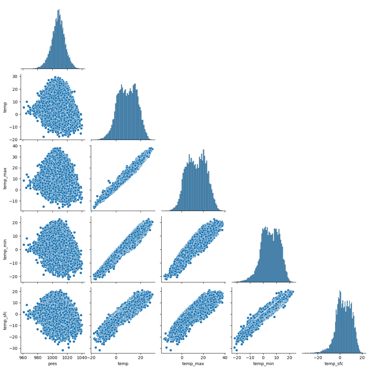
Now, we got an impression of the distributions and relations of the different features. We notice a strong reration between different temperature variables.
4.2.4. Drop missing data#
As a next step, we check the data for missing values.
df.isnull().sum()
pres        0
temp        0
temp_max    0
temp_min    0
temp_sfc    8
dtype: int64
As we can see, the percentage of missing values in our data is very small (148 out of 26298 rows). Therefore, the simplest solution is to simply drop all rows with missing data. If the percentage were higher, other solutions might be more useful, such as imputing values for the missing values. Read more about dealing with zero missings here.
df.dropna(axis=0, inplace=True)
df
| pres | temp | temp_max | temp_min | temp_sfc | |
|---|---|---|---|---|---|
| 0 | 1025.60 | -3.2 | -1.1 | -4.9 | -6.3 |
| 1 | 1005.60 | 1.0 | 2.2 | -3.7 | -5.3 |
| 2 | 996.60 | 2.8 | 3.9 | 1.7 | -1.4 |
| 3 | 999.50 | -0.1 | 2.1 | -0.9 | -2.3 |
| 4 | 1001.10 | -2.8 | -0.9 | -3.3 | -5.2 |
| ... | ... | ... | ... | ... | ... |
| 26293 | 998.13 | -3.7 | -0.7 | -7.9 | -9.9 |
| 26294 | 990.17 | -0.5 | 2.7 | -3.9 | -5.1 |
| 26295 | 994.40 | 4.0 | 5.6 | 1.8 | 0.0 |
| 26296 | 1001.70 | 9.0 | 12.7 | 4.6 | 2.3 |
| 26297 | 1004.72 | 12.8 | 14.0 | 11.5 | 10.7 |
26290 rows × 5 columns
df.describe()
| pres | temp | temp_max | temp_min | temp_sfc | |
|---|---|---|---|---|---|
| count | 26290.000000 | 26290.00000 | 26290.000000 | 26290.000000 | 26290.000000 |
| mean | 1007.808868 | 9.36466 | 13.520822 | 5.365135 | 3.667554 |
| std | 9.132328 | 7.62621 | 8.969154 | 6.730699 | 6.793801 |
| min | 961.000000 | -17.90000 | -16.400000 | -21.800000 | -31.600000 |
| 25% | 1002.300000 | 3.60000 | 6.400000 | 0.500000 | -0.900000 |
| 50% | 1008.200000 | 9.50000 | 13.600000 | 5.500000 | 3.700000 |
| 75% | 1013.700000 | 15.40000 | 20.600000 | 10.700000 | 9.000000 |
| max | 1040.000000 | 29.50000 | 37.900000 | 22.500000 | 21.000000 |
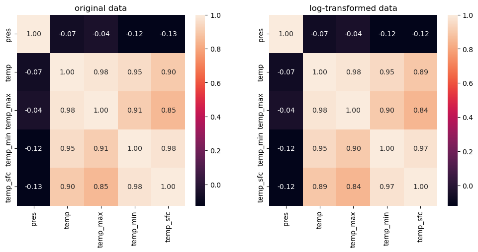
We notice the the range of the data differs! Often, we need data of the same scale for appropriate modelling. Therefore, we explain min-max scaling. Moreover, a lot of data sets are not normally distributed. But they need to be normally distributed to e.g. calculate the correlations in a mathematical correct way.
4.2.5. Feature scaling#
In the next steps it is exaplained how to transform the data to make the different variables (feature) comparable with each other min-max scaling and logistic transformation which transforms e.g. skew-symmetric data to a normally distributed data set. We comment the code, because our data is normally distributed. But you need it later for dealing with different data.
4.2.5.1. Min-Max scaling#
The min-max scaling
transforms the data into the range \([0,1]\). We want to avoid getting values with 0, because in the second step we need the logarithm of the values. Therefore, we use slightly larger boundary values \(x_{min}-1\) and \(x_{max}+1\). Thus
#min-max Scaling
#transform_cols = ["temp", "temp_max", "temp_min", "temp_sfc"] # ["COLUMN NAME", "COLUMN NAME"]

#df_transfo  =df.copy() # set an equivalent copy to perform the feature scales transformation

#xmin = df[transform_cols].min()
#xmax =  df[transform_cols].max()

# transform each column by its indiv. min/max
4.2.5.2. Logistic transformation#
As a second step, we use a logistic transformation $\(x''=\log\frac{x'}{1-x'}\)$
However, before we can start the transformation, we face a problem! Because we have transformed the test set with the values of the training set, the test set may contain values outside the range [0,1]. This will not work with the logarithm in the transformation.
#print(df_transfo[df_transfo[transform_cols].le(0).any(axis=1)])
#print(df_transfo[df_transfo[transform_cols].ge(1).any(axis=1)])
As we can see, there is no value below 0 in the test set.
If there is a value below 0: We basically have two options: either drop the data or impute new values. If we only have one problematic data set, we will drop it. For imputation, we could assign the minimum possible value to the problematic values. To do so, see the uncommented line below.
# df.drop(df[df[transform_cols].le(0).any(axis=1) | df[df].ge(1).any(axis=1)].index, inplace=True)
# Perform a logistic transformation on x′∈]0,1[ℝ

#df_transfo[transform_cols] = np.log(df_transfo[transform_cols] / (1 - df_transfo[transform_cols]))
Now we are ready to check our distributions again. We will plot all variables as histogram next to each other like so:
#df_transfo[transform_cols].hist(bins=35, figsize=(9, 6))
#plt.show()
#df.hist()
4.2.5.3. Back transformation#
The back transformation is the “logistic” function resp. inverse logit:
Exercise A:
Write function (
def ():...) that log transforms your data including a prior Min-Max-Scaling. This way we can generalise our approach well to new unseen data! (e.g. call itlogistic_min_max()function).
Exercise B:
The same way provide a function that back transformations this “logistic” function, resp. inverse logit! (call it
inv_logit()function)
### your code here ###
4.2.5.4. solution#
## A.


def min_max(variable):
    xmin, xmax = variable.min(), variable.max()
    min_max_done = (variable - xmin + 1) / (xmax - xmin + 2)
    return xmin, xmax, min_max_done


# df_transfo[transform_cols] = (df_transfo[transform_cols] - xmin + 1) / (xmax - xmin + 2)

test = np.arange(0, 100, 1)
xmin, xmax, min_max_variable = min_max(test)
def log_transform(min_max_variable):
    return np.log(min_max_variable / (1 - min_max_variable))


log_transform(min_max_variable)
array([-4.60517019, -3.90197267, -3.48635519, -3.18841662, -2.95491028,
       -2.76211742, -2.59738463, -2.45315795, -2.324564  , -2.20827441,
       -2.1019144 , -2.00372972, -1.91238746, -1.82685079, -1.7462971 ,
       -1.67006253, -1.59760345, -1.52846885, -1.46228027, -1.39871688,
       -1.3375042 , -1.2784054 , -1.22121461, -1.16575159, -1.11185752,
       -1.05939158, -1.00822823, -0.95825493, -0.90937029, -0.8614825 ,
       -0.81450804, -0.7683706 , -0.72300014, -0.67833209, -0.63430668,
       -0.59086833, -0.54796517, -0.50554857, -0.46357274, -0.42199441,
       -0.3807725 , -0.33986783, -0.29924289, -0.25886163, -0.2186892 ,
       -0.17869179, -0.13883644, -0.0990909 , -0.05942342, -0.01980263,
        0.01980263,  0.05942342,  0.0990909 ,  0.13883644,  0.17869179,
        0.2186892 ,  0.25886163,  0.29924289,  0.33986783,  0.3807725 ,
        0.42199441,  0.46357274,  0.50554857,  0.54796517,  0.59086833,
        0.63430668,  0.67833209,  0.72300014,  0.7683706 ,  0.81450804,
        0.8614825 ,  0.90937029,  0.95825493,  1.00822823,  1.05939158,
        1.11185752,  1.16575159,  1.22121461,  1.2784054 ,  1.3375042 ,
        1.39871688,  1.46228027,  1.52846885,  1.59760345,  1.67006253,
        1.7462971 ,  1.82685079,  1.91238746,  2.00372972,  2.1019144 ,
        2.20827441,  2.324564  ,  2.45315795,  2.59738463,  2.76211742,
        2.95491028,  3.18841662,  3.48635519,  3.90197267,  4.60517019])
## B.


# backtransform
## reverse min max und perform exp()
def inv_logit(xmin, xmax, logit_transf_variable):
    return (xmin - 1) + (xmax - xmin + 2) * np.exp(logit_transf_variable) / (
        1 + np.exp(logit_transf_variable)
    )


inv_logit(xmin, xmax, log_transform(min_max_variable))
array([4.4408921e-16, 1.0000000e+00, 2.0000000e+00, 3.0000000e+00,
       4.0000000e+00, 5.0000000e+00, 6.0000000e+00, 7.0000000e+00,
       8.0000000e+00, 9.0000000e+00, 1.0000000e+01, 1.1000000e+01,
       1.2000000e+01, 1.3000000e+01, 1.4000000e+01, 1.5000000e+01,
       1.6000000e+01, 1.7000000e+01, 1.8000000e+01, 1.9000000e+01,
       2.0000000e+01, 2.1000000e+01, 2.2000000e+01, 2.3000000e+01,
       2.4000000e+01, 2.5000000e+01, 2.6000000e+01, 2.7000000e+01,
       2.8000000e+01, 2.9000000e+01, 3.0000000e+01, 3.1000000e+01,
       3.2000000e+01, 3.3000000e+01, 3.4000000e+01, 3.5000000e+01,
       3.6000000e+01, 3.7000000e+01, 3.8000000e+01, 3.9000000e+01,
       4.0000000e+01, 4.1000000e+01, 4.2000000e+01, 4.3000000e+01,
       4.4000000e+01, 4.5000000e+01, 4.6000000e+01, 4.7000000e+01,
       4.8000000e+01, 4.9000000e+01, 5.0000000e+01, 5.1000000e+01,
       5.2000000e+01, 5.3000000e+01, 5.4000000e+01, 5.5000000e+01,
       5.6000000e+01, 5.7000000e+01, 5.8000000e+01, 5.9000000e+01,
       6.0000000e+01, 6.1000000e+01, 6.2000000e+01, 6.3000000e+01,
       6.4000000e+01, 6.5000000e+01, 6.6000000e+01, 6.7000000e+01,
       6.8000000e+01, 6.9000000e+01, 7.0000000e+01, 7.1000000e+01,
       7.2000000e+01, 7.3000000e+01, 7.4000000e+01, 7.5000000e+01,
       7.6000000e+01, 7.7000000e+01, 7.8000000e+01, 7.9000000e+01,
       8.0000000e+01, 8.1000000e+01, 8.2000000e+01, 8.3000000e+01,
       8.4000000e+01, 8.5000000e+01, 8.6000000e+01, 8.7000000e+01,
       8.8000000e+01, 8.9000000e+01, 9.0000000e+01, 9.1000000e+01,
       9.2000000e+01, 9.3000000e+01, 9.4000000e+01, 9.5000000e+01,
       9.6000000e+01, 9.7000000e+01, 9.8000000e+01, 9.9000000e+01])
4.2.5.5. Statistics - Mean, Median & Distributions#
Now, we may compute statistics :)
## calculate mean on original data:
df.mean(), df.median()
(pres        1007.808868
 temp           9.364660
 temp_max      13.520822
 temp_min       5.365135
 temp_sfc       3.667554
 dtype: float64,
 pres        1008.2
 temp           9.5
 temp_max      13.6
 temp_min       5.5
 temp_sfc       3.7
 dtype: float64)
## calculate mean on transformed data:
#mean_log = (xmin+1)+(xmax-xmin+2)*np.exp(df_transfo[transform_cols].mean())/(1+np.exp(df_transfo[transform_cols].mean()))

#mean_log
#median_log = (xmin+1)+(xmax-xmin+2)*np.exp(df_transfo[transform_cols].median())/(1+np.exp(df_transfo[transform_cols].median()))

#median_log
Exercise C:
Take a further feature from the data set, which is not normally distributed. Compare the mean, median and standard deviation of all variabels between original untransformed data and the back transformed mean, median and standard deviation of the log transformed data. Do you notice any difference?
### your code here ###
4.2.5.6. solution#
### log tranform your variable

df_transfo = df.copy()
transform_cols = [
    "temp",
    "temp_max",
    "temp_min",
    "temp_sfc",
]  # ["COLUMN NAME", "COLUMN NAME"]

xmin, xmax, df_transfo[transform_cols] = min_max(df_transfo[transform_cols])

df_transfo[transform_cols] = log_transform(df_transfo[transform_cols])

## calculate mean & median tranform back:
inv_logit(xmin, xmax, df_transfo[transform_cols].mean()), inv_logit(
    xmin, xmax, df_transfo[transform_cols].median()
)
(temp         9.767871
 temp_max    13.886515
 temp_min     5.842247
 temp_sfc     4.349503
 dtype: float64,
 temp         9.5
 temp_max    13.6
 temp_min     5.5
 temp_sfc     3.7
 dtype: float64)
## calculate mean on original data:
df[transform_cols].mean(), df[transform_cols].median()
(temp         9.364660
 temp_max    13.520822
 temp_min     5.365135
 temp_sfc     3.667554
 dtype: float64,
 temp         9.5
 temp_max    13.6
 temp_min     5.5
 temp_sfc     3.7
 dtype: float64)
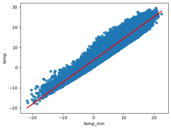
In order to showcase the simple linear regression we examine the relationship between two variables, the minimum temperature provided within the dataset as the predictor variable, and the maximum temperature as the response variable.
4.2.6. Drawing a sample#
For data preparation we randomly sample 50 time steps from the data set and build a data frame with the two variables of interest. Further we use the module matplotlib.pyplot to plot the data in form of a scatter plot to visualize the underlying linear relationship between the two variables.
df_sample = df.sample(n=50, replace=False, random_state=1)

x_sample = df_sample.loc[:, "temp_min"]
y_sample = df_sample.loc[:, "temp_max"]


import matplotlib.pyplot as plt

plt.xlabel("temperature minimum")
plt.ylabel("temperature maximum")
plt.scatter(x_sample, y_sample)
<matplotlib.collections.PathCollection at 0x132c3a6d0>
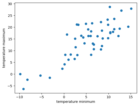
The visual inspection confirms our assumption that the relationship between the minimun and the maximum temperature variables is roughly linear. In other words, with increasing maximum temperature the minimum temperature tends to increase.
4.2.7. Parameter estimation#
Solving for \(\beta_0\) and \(\beta_1\) analytically in Python
As shown in the previous section the parameter \(\beta_0\) and \(\beta_1\) of a simple linear model may be calculated analytically. Recall the equation for a linear model from sample data
for \(\beta_1\)
and \(\beta_0\).
For a better understanding we use Python to calculate the individual terms using numpy
import numpy as np

# Calculate b1

x = df.loc[:, "temp_min"]
y = df.loc[:, "temp_max"]

x_bar = np.mean(x)
y_bar = np.mean(y)

b1 = np.sum((x - x_bar) * (y - y_bar)) / np.sum((x - x_bar) ** 2)
print("b1 =", b1)
b1 = 1.2105022692591816
The slope of the regression model is approximately b1. For a sanity check we calculate the ratio of the covariance of \(x\) and \(y\), applying the cov() function, and the variance of \(x\), using the var() function and compare it to the result from above.
import numpy as np

np.cov(x, y)[0][1] / np.var(x)
1.210548315220198
A great match!
Further, we calculate \(\beta_0\).
# Calculate b0
b0 = y_bar - b1 * x_bar
b0
7.026313473653632
The intercept \(\beta_0\) of the regression model is approximately 7.
Thus we can write down the regression model
Now, based on that equation we may determine the maximum temperature given its minimum temperature. Let us predict the temperature maximum at times where the temperature minimum 0, 5, 10 degrees.
temp_0 = b0 + b1 * 0
temp_5 = b0 + b1 * 5
temp_10 = b0 + b1 * 10

print(
    " Das prognostizierte Temperaturmaximum bei einem Temp. Minimum von 0 Grad C ist ",
    temp_0,
    "C",
)
print(
    " Das prognostizierte Temperaturmaximum bei einem Temp. Minimum von 5 Grad C ist ",
    temp_5,
    "C",
)
print(
    " Das prognostizierte Temperaturmaximum bei einem Temp. Minimum von 10 Grad C ist ",
    temp_10,
    "C",
)
 Das prognostizierte Temperaturmaximum bei einem Temp. Minimum von 0 Grad C ist  7.026313473653632 C
 Das prognostizierte Temperaturmaximum bei einem Temp. Minimum von 5 Grad C ist  13.07882481994954 C
 Das prognostizierte Temperaturmaximum bei einem Temp. Minimum von 10 Grad C ist  19.131336166245447 C
4.2.8. Using Python’ sklearn.linear_model to calculate \(\beta_0\) and \(\beta_1\)#
See also the more detailed explanations in https://realpython.com/linear-regression-in-python/
First, import the class sklearn.linear_model.LinearRegressio to perform linear and polynomial regression and make predictions accordingly
The second step is defining data to work with. The inputs (regressors, predictor variable, independent variable 𝑥) and output (predictor, dependent variable 𝑦) should be arrays (the instances of the class numpy.ndarray) or similar objects. This is the simplest way of providing data for regression:
from sklearn.linear_model import LinearRegression

x = df['temp_min'].values
y = df['temp_max'].values

print(x.shape, y.shape)

# we have to reshape the regressors
x = x.reshape((-1, 1))

print(x.shape, y.shape)

# set up the linear model
model = LinearRegression()

# find the linear function that fits the min/max temperature best:
model.fit(x, y)
(26290,) (26290,)
(26290, 1) (26290,)
LinearRegression()In a Jupyter environment, please rerun this cell to show the HTML representation or trust the notebook.
On GitHub, the HTML representation is unable to render, please try loading this page with nbviewer.org.
LinearRegression()
Let us look at the just calculated interception and slope of the linear equation:
print('intercept:', model.intercept_) # y-schnittpunkt
print('slope:', model.coef_) # slope
intercept: 7.026313473653561
slope: [1.21050227]
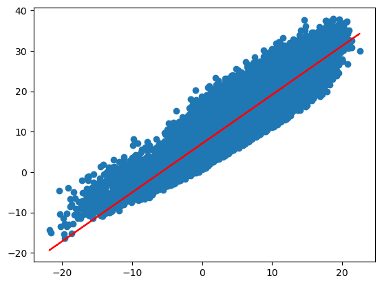
# y = b + a* x
y_regr_grade= model.intercept_ + model.coef_ * x

plt.scatter(x,y)
plt.plot(x,y_regr_grade, color = "red")
[<matplotlib.lines.Line2D at 0x134032700>]
4.2.9. Prediction#
Now, we have the linear model to predict the maximum temperature of randomly picked data point. We test if we get the same results as above and calculate the maximum temperature at minimal temperatures of 0, 5 and 10 \(°C\).
sample_minTemp = np.array([0,5,10])

# max temp:
y_pred = model.intercept_ + model.coef_ * sample_minTemp
print(y_pred)
[ 7.02631347 13.07882482 19.13133617]
We can also use .predict() to pass the regressor as the argument and get the corresponding predicted response. We first have to reshape the sample_minTemp:
sample_minTemp = sample_minTemp.reshape((-1, 1))

y_pred = model.predict(sample_minTemp)

print(y_pred)
[ 7.02631347 13.07882482 19.13133617]
Take a look at the scatter plot again and let us plot the regression line into the scatter plot. We define a function that will plot the scatter plot of the minimum/maximum temperature of the DWD data set.
plt.scatter(x,y,c='steelblue', edgecolor = 'white',s=70)
plt.xlabel("Min. Temp. (log)")
plt.ylabel("Max. Temp. (log)")
# linear regression line:
y_pred = model.predict(x)

plt.plot(x,y_pred, color = 'red')
[<matplotlib.lines.Line2D at 0x13408f820>]
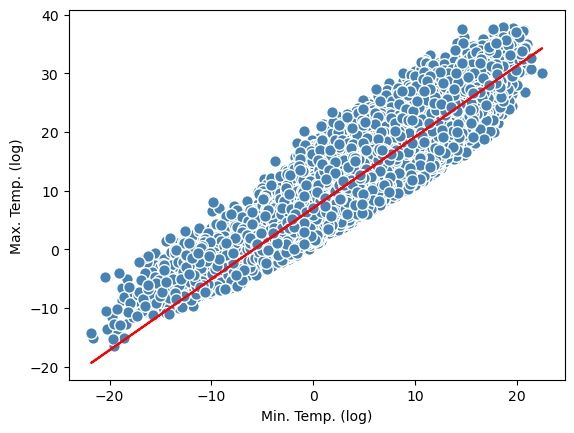
Yes! We get the same results as above, where we calculated the intercept and the slope manually!
4.3. Model diagnostic#
Regression validation or regression diagnostic is a set of procedures that are applied to assess the numerical results of a regression analysis. The procedures include methods of graphical and quantitative analysis or a formal statistical hypothesis test. In this section we focus on the two foremost methods, the graphical and the quantitative analysis. Statistical hypothesis tests for regression problems are provided in the section on hypothesis testing.
4.3.1. Coefficient of Determination#
The Coefficient of Determination, also denoted as \(R^2\), is the proportion of variation in the observed values explained by the regression equation. In other words, \(R^2\) is a statistical measure of how well the regression line approximates the real data points, thus it is a measure of the goodness of fit of the model.
The total variation of the response variable \(y\) is based on the deviation of each observed value \(y_i\) from the mean value \(\bar y\). This quantity is called total sum of squares, SST and is given by
This total sum of squares (SST) can be be decomposed into two parts: the deviation explained by the regression line, \(\hat y_i-\bar y\), and the remaining unexplained deviation \(y_i-\hat y_i\). Consequently, the the amount of variation that is explained by the regression is called the sum of squares due to regression, SSR and is given by
The ratio of the sum of squares due to regression (SSR) and the total sum of squares (SST) is called the coefficient of determination and is denoted \(R^2\).
\(R^2\) lies between 0 and 1. A value of near 0 suggests that the regression equation is not capable of explaining the data. An \(R^2\) of 1 indicates that the regression line perfectly fits the data.
Just for the sake of completeness the variation in the observed values of the response variable not explained by the regression is called sum of squared errors of prediction, SSE and is given by
Recall that the SSE quantity is minimized to obtain the best regression line to describe the data, also known as the ordinary least squares method (OLS).
We can calculate coefficient of determination (\(R^2\), see also the first lecture) with .score():
r_sq = model.score(x, y)

print('coefficient of determination:', r_sq)
coefficient of determination: 0.8251798025189557
This looks quiet good!
4.4. From the Machine Learning perspective:#
Today, we have created a first Machine Learning model!


The machine-learning figures are adapted from the first chapter in Raschka & Mirjalili (2017).
If you would like to find a model to make future preditions, you first split the data into a
training set to train a model, for example: take 80% of your data to find the linear regression line
and a test set to test the trained model. E.g: to test, if the linear regression line also fits to your test set
The training set has to be large enough to yield statistically meaningful results! It has to be representative of the data set as a whole. In other words, don’t pick a test set with different characteristics than the training set. Assuming that your test set meets the preceding two conditions, your goal is to create a model that generalizes well to new data. Our test set serves as a proxy for new data.
If you want to learn more about Train-Test-Splitting, click here!
### Train und test data set
from sklearn.model_selection import train_test_split

# Let us take a sample again, this time with a sample size of n=100
# that we split into a trainings data with 70% of the data and
# and a test data with the 30% of the data

df_sample = df.sample(n=100, replace=False, random_state=1)

x = df_sample['temp_min'].values
y = df_sample['temp_max'].values

X = x.reshape((-1,1))

X_train, X_test, y_train, y_test = train_test_split(X,y, test_size = 0.3, random_state =  0)

model = LinearRegression()
model.fit(X_train,y_train)

y_train_predict = model.predict(X_train)
y_test_predict = model.predict(X_test)

plt.scatter(X_train,y_train,c='steelblue', edgecolor = 'white',label = 'trainings data')
plt.scatter(X_test,y_test,c='limegreen', edgecolor = 'white', label = 'test data')
plt.legend(loc = 'upper left')
plt.xlabel('min. Temp')
plt.ylabel('max Temp')

# linear regression line:
plt.plot(X_train,y_train_predict, color = 'red')
[<matplotlib.lines.Line2D at 0x1341153a0>]
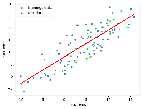
Great! You have implemented a machine leraning algorithm! You fitted a line on a data set, which can now be used for prediction of the maximal temperature by the knowldedge of the minimal temperature!
4.5. Residual analysis#
A residuals of an observed value is the difference between the observed value and the estimated value \((y_i−\hat{y}_i)\). It is the leftover after fitting a model to data. The sum of squared errors of prediction (SSE), also known as the sum of squared residuals or the error sum of squares is an indicator how well a model represents data.
If the absolute residuals, defined for observation \(x_i\) as \(y_i−\hat{y}_i\) are unusually large, it may be that the observation is from a different population, or that there was some error in making or recording the observation.
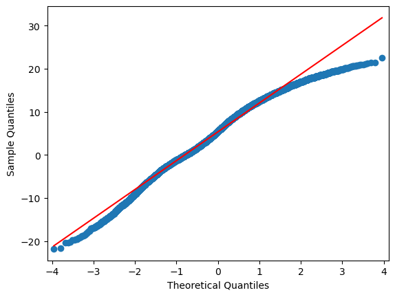
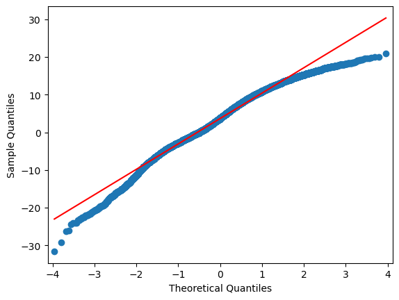
In addition we may analyse the residuals to check if linear regression assumptions are met. Regression residuals should be approximately normally-distributed; that is, the regression should explain the structure and whatever is left over should just be noise, caused by measurement errors or many small uncorrelated factors. The normality of residuals can be checked graphically by a plot of the residuals against the values of the predictor variable. In such a residual plot, the residuals should be randomly scattered about 0 and the variation around 0 should be equal.
If the assumptions for regression inferences are met, the following two conditions should hold (Weiss 2010):
A plot of the residuals (residual plot) against the values of the predictor variable should fall roughly in a horizontal band centered and symmetric about the x-axis.
A normal probability plot of the residuals should be roughly linear.
plt.scatter(y_train,y_train_predict - y_train, c='steelblue', edgecolor = 'white',label = 'trainings data')
plt.scatter(y_test,y_test_predict - y_test, c='limegreen', edgecolor = 'white', label = 'test data')
plt.axhline(y=0)
plt.legend(loc = 'upper left')
plt.xlabel('min Temp')
plt.ylabel('Residuals')
Text(0, 0.5, 'Residuals')
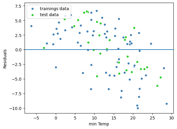
The residuals are fairly well distributed around zero indicating that the linear model assumptions for that model are fulfilled.
For an overview on different methods how to check the quality of the regression model in python, click here.
from sklearn.metrics import mean_squared_error

print('MSE train:', mean_squared_error(y_train,y_train_predict))
print('MSE test:', mean_squared_error(y_test,y_test_predict))
MSE train: 19.584438118151994
MSE test: 14.510185438570927
### linear fit, polynomial fit --> See chapter 10 of the Raschka and Mirjalili (2017)
## Can we fit polynomes?

from sklearn.preprocessing import PolynomialFeatures
from sklearn.metrics import mean_squared_error, r2_score


regr = LinearRegression()

# create quadratic features
quadratic = PolynomialFeatures(degree=2)
cubic = PolynomialFeatures(degree=3)
X_quad = quadratic.fit_transform(X)
X_cubic = cubic.fit_transform(X)

# fit features
X_fit = np.arange(X.min(), X.max(), 1)[:, np.newaxis]

regr = regr.fit(X, y)
y_lin_fit = regr.predict(X_fit)


regr = regr.fit(X_quad, y)
y_quad_fit = regr.predict(quadratic.fit_transform(X_fit))


regr = regr.fit(X_cubic, y)
y_cubic_fit = regr.predict(cubic.fit_transform(X_fit))


# plot results
plt.scatter(X, y, label='training points', color='lightgray')

plt.plot(X_fit, y_lin_fit,
         label='linear (d=1)',
         color='blue',
         lw=2,
         linestyle=':')

plt.plot(X_fit, y_quad_fit,
         label='quadratic (d=2)',
         color='red',
         lw=2,
         linestyle='-')

plt.plot(X_fit, y_cubic_fit,
         label='cubic (d=3)',
         color='green',
         lw=2,
         linestyle='--')

plt.xlabel('minimum temperature °C')
plt.ylabel('maximum temperature °C')
plt.legend(loc='upper right')

plt.show()
4.6. Exercises#
Exercise 2A
Find the best regression line of the minimal temperature and the mean temperature of the weather station Dahlem.
### your code here ###
4.6.1. solution#
x = df['temp_min'].values
y = df['temp'].values

# we have to reshape the regressors
x = x.reshape((-1, 1))


# set up the linear model
model = LinearRegression()

# find the linear function that fits the min/max temperature best:
model.fit(x, y)
LinearRegression()In a Jupyter environment, please rerun this cell to show the HTML representation or trust the notebook.
On GitHub, the HTML representation is unable to render, please try loading this page with nbviewer.org.
LinearRegression()
print('intercept:', model.intercept_)
print('slope:', model.coef_)
intercept: 3.575855043366209
slope: [1.07896716]
## Now, we can easily plot using the 2 coefficients: m*x +n -->
plt.scatter(x,y)
plt.plot(x, model.coef_*x + model.intercept_, color = "red")
[<matplotlib.lines.Line2D at 0x134333d90>]
## or just use the seaborn package (sns.regplot)

sns.regplot(data=df, x="temp_min", y="temp",line_kws=dict(color="r"), ci = 95)
<Axes: xlabel='temp_min', ylabel='temp'>
Exercise 2B
Next, we import the module
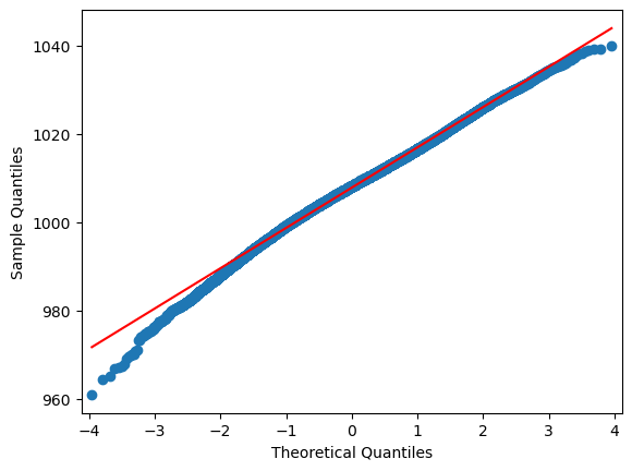
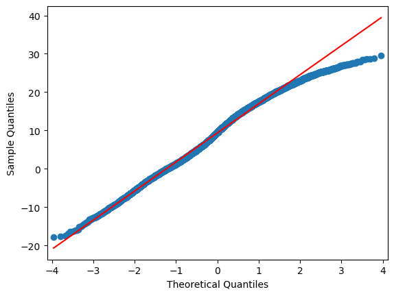
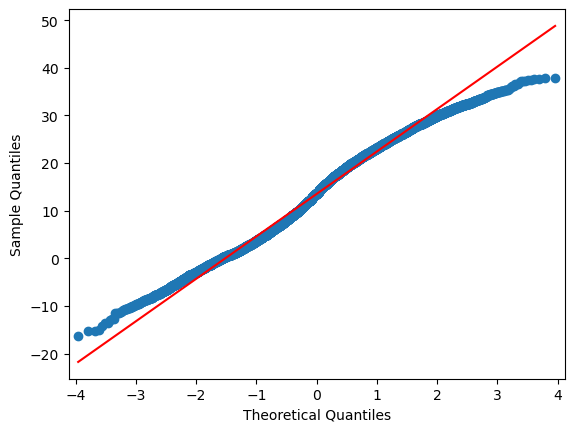
scipy.statfor Q-Q plots and plot all variables in a for-loop. Of course, you can also plot step py step.
### your code here ###
4.6.2. solution#
import statsmodels.api as sm

for i in range(0,len(df.columns)):
    sm.qqplot(df.iloc[:,i], line="r")
4.6.3. Extra: Machine Learning approach:#
Exercise 2C (just for fun, this is extra)
a) Take again two variables the meteorological data set and devide the data into trainings and test data
b) Find either a linear model, a quadratic or a cubic (see the example code below) for your training data set and test if it fits!
### your code here ###
# do each column by hand ....
stats.pearsonr(df["temp_min"], df["temp_max"])

# or easily use the .corr() function of the entire df:

df.corr(method="pearson")
| pres | temp | temp_max | temp_min | temp_sfc | |
|---|---|---|---|---|---|
| pres | 1.000000 | -0.069212 | -0.042117 | -0.123350 | -0.125634 |
| temp | -0.069212 | 1.000000 | 0.981847 | 0.952269 | 0.902622 |
| temp_max | -0.042117 | 0.981847 | 1.000000 | 0.908394 | 0.852836 |
| temp_min | -0.123350 | 0.952269 | 0.908394 | 1.000000 | 0.975749 |
| temp_sfc | -0.125634 | 0.902622 | 0.852836 | 0.975749 | 1.000000 |
df.corr()
| pres | temp | temp_max | temp_min | temp_sfc | |
|---|---|---|---|---|---|
| pres | 1.000000 | -0.069212 | -0.042117 | -0.123350 | -0.125634 |
| temp | -0.069212 | 1.000000 | 0.981847 | 0.952269 | 0.902622 |
| temp_max | -0.042117 | 0.981847 | 1.000000 | 0.908394 | 0.852836 |
| temp_min | -0.123350 | 0.952269 | 0.908394 | 1.000000 | 0.975749 |
| temp_sfc | -0.125634 | 0.902622 | 0.852836 | 0.975749 | 1.000000 |
df_transfo.corr()
| pres | temp | temp_max | temp_min | temp_sfc | |
|---|---|---|---|---|---|
| pres | 1.000000 | -0.066808 | -0.042975 | -0.118797 | -0.116435 |
| temp | -0.066808 | 1.000000 | 0.980614 | 0.945663 | 0.891206 |
| temp_max | -0.042975 | 0.980614 | 1.000000 | 0.901528 | 0.842826 |
| temp_min | -0.118797 | 0.945663 | 0.901528 | 1.000000 | 0.972604 |
| temp_sfc | -0.116435 | 0.891206 | 0.842826 | 0.972604 | 1.000000 |
fig, ax = plt.subplots(1,2, figsize=(12,5))


sns.heatmap(df.corr(), annot=True,  fmt=".2f", ax = ax[0])
sns.heatmap(df_transfo.corr(), annot=True,  fmt=".2f", ax = ax[1])

ax[0].set_title("original data")
ax[1].set_title("log-transformed data")
plt.show()
Q |
LF |
NO3 |
SO4 |
Ca |
Mg |
PO4 2- |
Fe3+ |
|
|---|---|---|---|---|---|---|---|---|
Q |
1 |
|||||||
LF |
-0,87 |
1 |
||||||
NO3 |
0,61 |
-0,84 |
1 |
|||||
SO4 |
-0,74 |
0,88 |
-0,36 |
1 |
||||
Ca |
-0,56 |
0,73 |
-0,67 |
0,69 |
1 |
|||
Mg |
-0,44 |
0,7 |
-0,62 |
0,62 |
0,38 |
1 |
||
PO4 2- |
-0,7 |
0,81 |
0,86 |
0,31 |
0,76 |
0,71 |
1 |
|
Fe3+ |
-0,65 |
0,77 |
-0,76 |
0,84 |
0,71 |
0,7 |
-0,81 |
1 |
ehemaliger Braunkohleabbau (Fe3+, SO4 2-) oder die Landwirtschaft (PO43-, NO3, SO4 2-) ? Korrelation zwischen Fe3+ und SO4 am höchsten –> also vermutlich verlaufen die Fließpfade durch ehem. Braunkohleabbaugebiete oder werden durch diese beeinfliusst.
elev_NN = np.array([300, 500, 840, 1160, 1830, 2100, 2400])  # m a. s.l.
precip = np.array([1800, 1250, 700, 510, 410, 310, 230])  # mm/a
from IPython.display import IFrame

IFrame(
    src="../../citations/citation_Soga.html",
    width=900,
    height=200,
)